Chapter 3 Regression Example
3.1 Background & Data
This regression example is inspired by the blog post “The Effect of Childhood Education on Wealth: Modeling with Bayesian Additive Regression Trees (BART)” on R-bloggers by Selcuk Disci. We aim to explore how enrollment rates in early childhood education are associated with household net worth for all countries involved in the Organisation of Economic Co-operation and Development (OECD), using datasets provided by this organization. The OECD collects data on enrollment rates in early childhood education and household net worth from its member countries every year from 2000 to 2020, through standardized surveys and national statistics, ensuring consistent and comparable data across all countries involved.
According to OECD, the enrollment rates for each childhood age group, 3-year-old, 4-year-old, and 5-year-old are calculated by dividing the number of children enrolled in early childhood education and care (ECEC) of a particular age group by the total population of that age group. It is notable that this calculation does not distinguish between full-time and part-time enrollment.
The household net worth indicator first calculates the overall financial status of households by measuring the total value of their assets (both financial, like stocks and savings, and non-financial, like real estate) and subtracting the total value of their outstanding debts (such as loans and mortgages). This result is then presented as a percentage of the households’ annual income. Essentially, this indicator provides a snapshot of the economic health and financial stability of households by showing how much wealth they have in relation to how much they earn each year. By definition, the unit of household net worth is percent.
Here, we demonstrate how to use the Bayesian Additive Regression Trees (BART) model to capture the relationship between enrollment rates in early childhood education in a country and its average household net worth.
3.2 Data Wrangling
We start here by loading some packages for the data and modeling, as well as cleaning and wrangling the data.
Note: Code chunks with the comments saying “Rbloggers code is from “The Effect of Childhood Education on Wealth: Modeling with Bayesian Additive Regression Trees (BART)” on R-bloggers by Selcuk Disci.
# Rbloggers code
library(tidyverse)
library(tidymodels)
library(ggplot2)
library(countrycode)
library(plotly)
library(sysfonts)
library(showtext)
library(glue)
library(scales)
library(janitor)
library(DALEXtra)
library(dbarts)

#Loading the datasets
df_childhood <- read_csv("https://raw.githubusercontent.com/mesdi/blog/main/childhood.csv")
df_household <- read_csv("https://raw.githubusercontent.com/mesdi/blog/main/household.csv")

#Joining them by country and time
df <-
  df_childhood %>%
  left_join(df_household, by = c("country", "time")) %>%
  na.omit()

#Wrangling the dataset
df_tidy <-
  df %>%
  mutate(household = round(household, 2),
         childhood = round(childhood, 2),
         age = str_replace(age, "_", "-"),
         country_name = countrycode(country, "genc3c", "country.name")
         )


#Best 20 countries based on the household net worth in their last year
df_tidy %>%
  group_by(country) %>%
  slice_max(time) %>%
  slice_max(household, n=20) %>%
  mutate(age = fct_reorder(age, childhood, .desc = TRUE),
         country_name = fct_reorder(country_name, household, .desc = TRUE)) %>%
  ggplot(aes(x=country_name,
             y=childhood,
             fill = age,
             #Hover text of the barplot
             text = glue("{country}\n%{childhood}\n{age}\nChildhood education"))) +
  geom_col() +
  geom_line(aes(y=household/2, group = 1),
            color= "skyblue",
            size=1) +
  #Adding the household net worth as a second(dual) y-axis
  scale_y_continuous(sec.axis = sec_axis(~.*2)) +
  scale_fill_viridis_d(name = "") +
  xlab("") +
  ylab("") +
  theme_minimal() +
  theme(
    axis.text.x = element_text(angle = 60),
    axis.text.y = element_blank(),
    axis.text.y.right = element_blank(),
    panel.grid = element_blank(),
    legend.position = "none"
    ) -> p


#adding google font
font_add_google(name = "Henny Penny", family = "henny")
showtext_auto()

#setting font family for ggplotly
font <- list(
  family= "Henny Penny",
  size =5
  )
Let’s take a look at the cleaned dataset:
head(df_tidy)
## # A tibble: 6 × 6
##   country age    time childhood household country_name
##   <chr>   <chr> <dbl>     <dbl>     <dbl> <chr>
## 1 AUS     AGE-3  2010      71.8      347. Australia
## 2 AUS     AGE-3  2013      62.3      366. Australia
## 3 AUS     AGE-3  2014      69.4      383. Australia
## 4 AUS     AGE-3  2015      68.4      402. Australia
## 5 AUS     AGE-3  2016      63.3      428. Australia
## 6 AUS     AGE-3  2017      66.0      439. Australia
Before modeling the relationship between average household net worth and the enrollment rate of childhood education for different age groups, we can plot this information together to get some initial insights.
# Rbloggers code
#Plotly chart
ggplotly(p, tooltip = c("text")) %>%
  #Hover text of the line
  style(text = glue("{unique(p$data$country)}\n%{unique(p$data$household)}\nHousehold net worth"),traces = 6) %>%
  layout(font=font)
In the graph above, yellow portions of the bars represent childhood enrollment rate for 3-year-olds, teal represents that for 4-year-olds, and purple represents that for 5-year-olds. The light blue trend line shows the average household net worth for each country in the dataset. Before modeling anything, a vague and general takeaway is that the childhood enrollment rate seems to be positively related to the average household net worth in that country.
With that in mind, we will model this relationship with BART in the next section.
3.3 Implementation
BART has been implemented in various R packages. In order to run the two packages we use in this tutorial, which are dbarts and tidymodels, we start by splitting our data into a training set and and a test set. This way we can train the model and evaluate the performance on the test set using cross validation.
# Rbloggers code
#Splitting the data into train and test sets
set.seed(1234)
df_split <-
  df_tidy %>%
  #Converting the levels to variables for modeling
  pivot_wider(names_from = age, values_from = childhood) %>%
  clean_names() %>%
  na.omit() %>%
  initial_split()

df_train <- training(df_split)
df_test <- testing(df_split)
3.3.1 dbarts package
The function we are using under the dbarts package is called bart. To fit a BART model, we need to feed in the independent variables for the x.train parameter and the response variable for the y.train parameter.
In our case, the independent variables are the age 3, age 4, and age 5 education enrollment rates, and the response variable is the household net worth. To input these information into the bart function, we specify their column indices to access them.
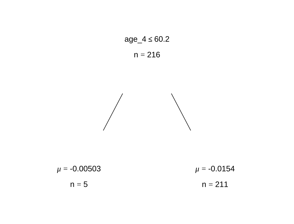
We also set keeptrees = TRUE in order for the resulting fitted model to store the splitting information and the configuration of each single tree that we have. We did this because we would like to view some examples of what variable a tree chose, what the split rule is, and how long before the tree terminates.
The parameter ndpost specifies the number of iterations we want after the burn-in period, while the default number of iterations inside the burn-in period is 100.
The printed descriptive output of the bart function shows the specific parameters that were used to fit the BART model, which were introduced in our methodology chapter.
 # Fitting a BART model with default 1,000 iterations of 200 trees
set.seed(4343)
bartFit <- bart(x.train = as.matrix(df_train[,5:7]), y.train = as.numeric(unlist(df_train[,3])),keeptrees = TRUE, ndpost = 1000)
##
## Running BART with numeric y
##
## number of trees: 200
## number of chains: 1, number of threads 1
## tree thinning rate: 1
## Prior:
##  k prior fixed to 2.000000
##  degrees of freedom in sigma prior: 3.000000
##  quantile in sigma prior: 0.900000
##  scale in sigma prior: 0.004462
##  power and base for tree prior: 2.000000 0.950000
##  use quantiles for rule cut points: false
##  proposal probabilities: birth/death 0.50, swap 0.10, change 0.40; birth 0.50
## data:
##  number of training observations: 216
##  number of test observations: 0
##  number of explanatory variables: 3
##  init sigma: 103.908284, curr sigma: 103.908284
##
## Cutoff rules c in x<=c vs x>c
## Number of cutoffs: (var: number of possible c):
## (1: 100) (2: 100) (3: 100)
## Running mcmc loop:
## iteration: 100 (of 1000)
## iteration: 200 (of 1000)
## iteration: 300 (of 1000)
## iteration: 400 (of 1000)
## iteration: 500 (of 1000)
## iteration: 600 (of 1000)
## iteration: 700 (of 1000)
## iteration: 800 (of 1000)
## iteration: 900 (of 1000)
## iteration: 1000 (of 1000)
## total seconds in loop: 0.452259
##
## Tree sizes, last iteration:
## [1] 2 2 2 3 4 3 4 2 2 2 3 2 2 4 2 2 2 2
## 2 3 2 1 2 4 2 2 3 2 2 2 2 2 2 1 2 1 2 1
## 2 5 2 2 3 3 4 2 2 1 3 2 2 2 2 1 3 2 1 2
## 1 2 2 2 3 2 2 1 3 2 2 2 4 2 3 2 2 1 3 2
## 2 3 4 2 4 2 2 3 2 2 2 2 2 2 3 2 2 3 2 3
## 4 2 2 2 3 2 2 2 2 2 3 2 4 2 2 1 2 2 2 2
## 2 2 3 2 2 2 4 2 1 3 2 2 4 2 2 2 3 3 4 3
## 2 2 2 3 2 2 2 4 2 2 2 1 2 2 2 2 3 2 2 2
## 1 2 2 3 3 3 2 2 2 2 3 1 2 2 3 2 3 3 2 2
## 1 4 3 2 2 2 2 2 2 2 2 2 2 2 3 3 2 2 2 2
## 2 2
##
## Variable Usage, last iteration (var:count):
## (1: 77) (2: 91) (3: 86)
## DONE BART

# Extracting trees from model
trees <- extract(bartFit, "trees")

 # Looking at some examples of trees from model
bartFit$fit$plotTree(chainNum = 1, sampleNum = 3, treeNum = 1)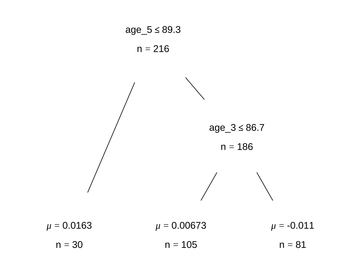
3.3.2 bartMan package
Using the bartMan package, we can look at more interesting visualizations that show us some model diagnostics as well as what our trees look like in a fitted model.
 # Loading packages for BART visualization
library(bartMan)
library(ggridges)

bartDiag(model = bartFit, response = "household", burnIn = 1000, data = df_tidy)
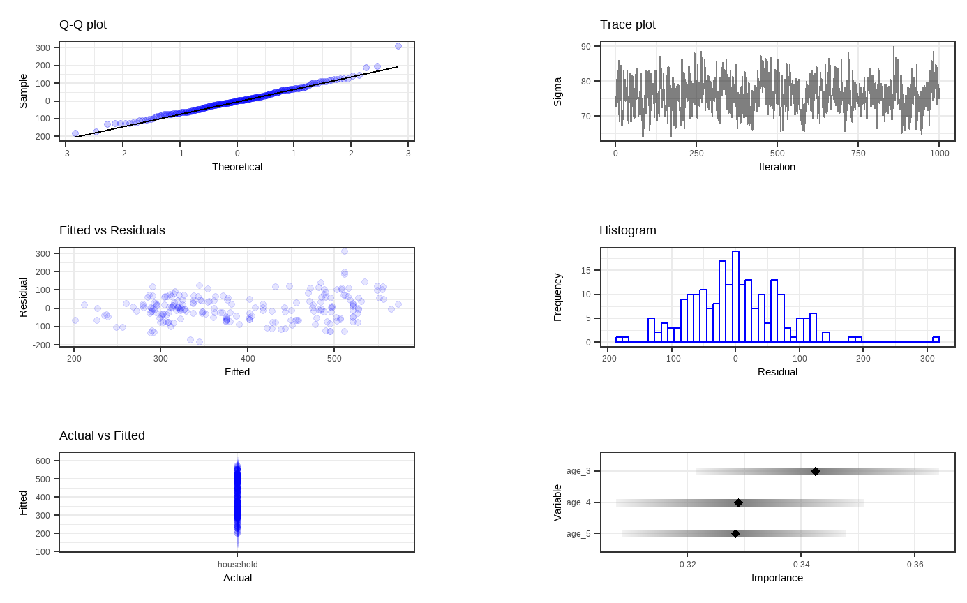
Shown above are six general diagnostic plots for the BART regression fit on our dataset. Top left: A QQ-plot of the residuals after fitting the model. Top right: trace plot of \(\sigma\) from MCMC iteration. Middle left: Residuals versus fitted values with 95% credible intervals. Middle right: A histogram of the residuals. Bottom Left: Actual values versus fitted values with 95% credible intervals. (This is unfornately not working properly due to unknown reasons). Bottom right: Variable importance plot with 25 to 75% quantile interval shown. In our case, the BART model decides that the enrollment rate of childhood education for 3-year-olds is the most important variable.
Then, we want to visualize all the trees we fitted across all iterations. For less computational time and simplicity, we reduce the number of trees as well as the number of iterations for each tree. With dbarts, we fit a new model with the same variables with 50 trees for 10 iterations.
 # Fitting another BART model with fewer trees and less iterations
set.seed(4343)
bartFit50 <- bart(x.train = as.matrix(df_train[,5:7]), y.train = as.numeric(unlist(df_train[,3])), keeptrees = TRUE, ntree = 50, ndpost = 10, verbose = FALSE)
# Extracting the tree data
trees_data50 <- extractTreeData(bartFit50, df_tidy)
# Visualizing what each of the 50 trees look like over their 10 iterations
plotTrees(trees = trees_data50, fillBy = NULL, sizeNodes = TRUE)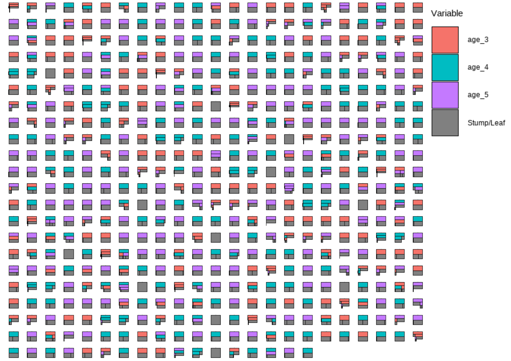
In the plot above, each little box represents a single tree. There are 500 boxes, thus 500 = 50 \(\cdot\) 10 trees, because it is showing all the trees (50 trees) built in all iterations after the burn-in period (10 iterations) in the reduced model. Different colors represent different variables that a tree is splitting on, and the gray represents a stump/leaf, or a terminal node.
While this plot is useful, it is hard to get insight from it because that is too much to look at at one time. To deal with that, we can specify one tree to look at all the iterations (10) of it. Here we are using the \(13^{th}\) as an example:
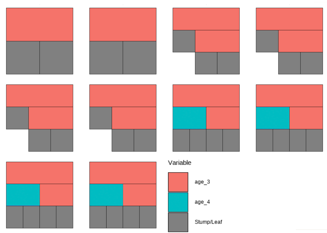
However, that is only the information of one tree. An even better alternative to grab information efficiently is to use the treeBarPlot function in the bartMan package. This function creates a bar plot that shows how many times each specific structure of tree, including which variable the tree splits on (but not its splitting rule value), shows up within the model. We also create a density plot that shows the splitting variables and the frequency at which each splitting rule value is chosen.
 # Creating bar plot showing frequency of 8 most common trees from model
treeBarPlot(trees_data50, topTrees = 8, iter = NULL)

 # Creating density plot of variable split levels values
splitDensity(trees = trees_data50, data = df_tidy, display = 'ridge')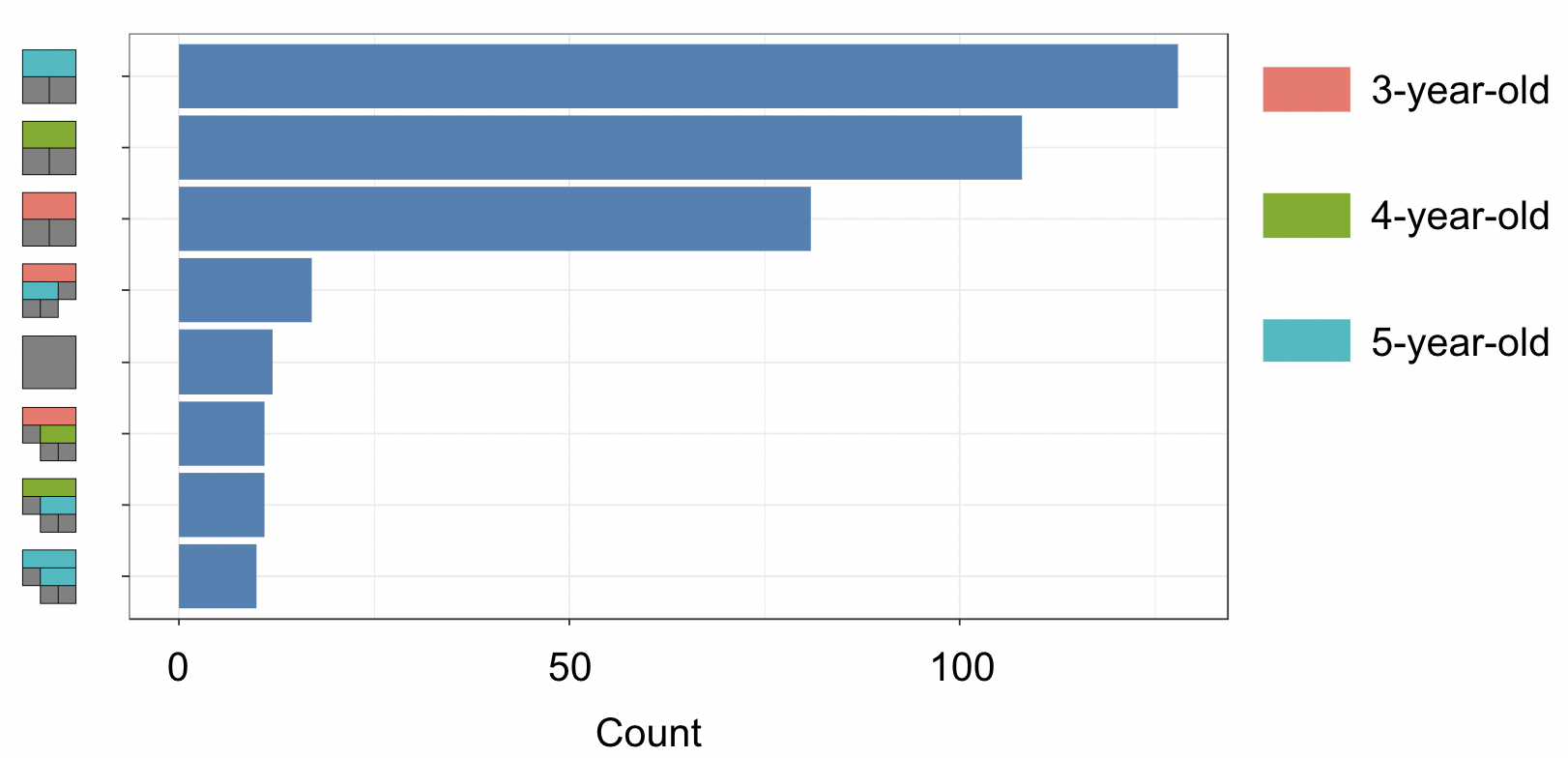
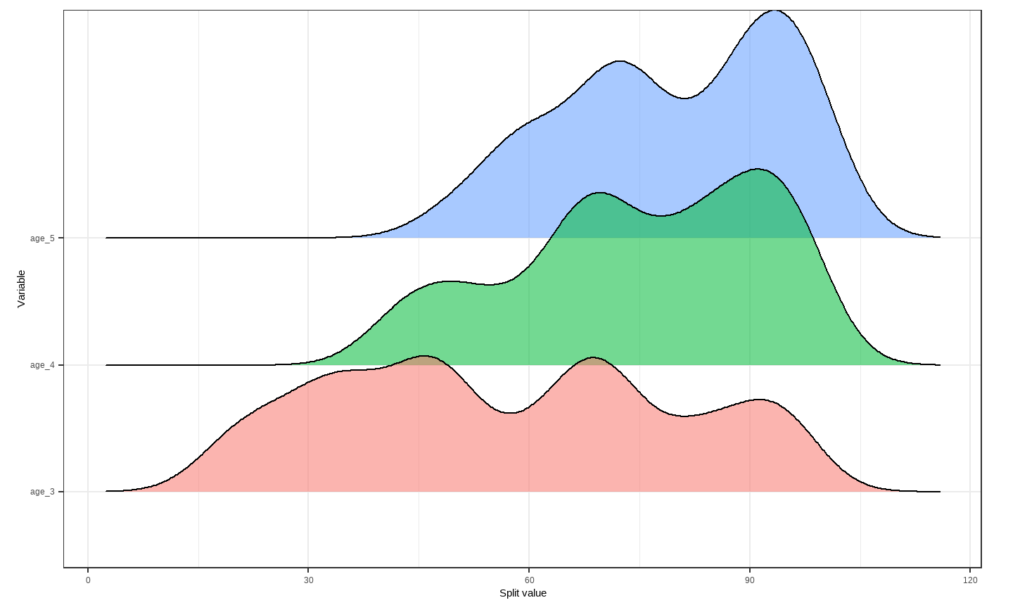
Note: These visuals can be interesting to look at and interpret, but there is a discrepancy in the colors that are shown between the 500-tree plot, the density plot, and the bar plot. There is no legend argument for the treeBarPlot, so we manually added in the legends for these later plots. We made sure that the variables match the colors as described in the legend by checking original code of the function treeBarPlot.
3.3.3 tidymodels package
Next, we decide to use the tidymodels package to fit our BART model and assess its overall performance. This is because tidymodels is more comprehensive and provides an standardized workflow for not only training and testing the model, but also performing cross-validation on the model. The steps for this package are universal for machine learning in R.
# Rbloggers code
#Preprocessing
df_rec <- recipe(household ~ age_3 + age_4 + age_5, data = df_train)

#Modeling with BART
df_spec <-
  parsnip::bart() %>%
  set_engine("dbarts", keeptrees = TRUE) %>%
  set_mode("regression")

#Workflow
df_wf <-
  workflow() %>%
  add_recipe(df_rec) %>%
  add_model(df_spec)

#cross-validation for resamples
set.seed(12345)
df_folds <- vfold_cv(df_train)

#Resampling for the accuracy metrics
set.seed(98765)
df_rs <-
  df_wf %>%
  fit_resamples(resamples = df_folds)

#Computes the accuracy metrics
collect_metrics(df_rs)
## # A tibble: 2 × 6
##   .metric .estimator   mean     n std_err .config
##   <chr>   <chr>       <dbl> <int>   <dbl> <chr>
## 1 rmse    standard   85.2      10  4.79   Preprocessor1_Model1
## 2 rsq     standard    0.528    10  0.0458 Preprocessor1_Model1
The output we see above are quality metrics for our model. Our RMSE average value shows the average difference between the observed and predicted values of household net worth to be 85.2 percent, since the household net worth is a percentage by its definition. That is, the prediction we get from this built BART model is off by 85.2 percent on average. Given that the household net worth ranges from 134 percent to 824 percent in our dataset, we think the BART model has a decent performance.
Additionally, the \(R^2\) value provides us insights on how well the model fit our data. We observe a value of 0.528, which means that 52.8% of the data can be explained by the fitted BART model. We would like to be closer to 1 in order for the model to explain more variability in the data.
To refine our BART model, we can also tune the priors instead of simply using the default ones. Here, we demonstrate how to use grid search to tune the priors of the BART model. These priors include the number of trees, terminal node coefficient, and the exponential component of the prior distribution for these terminal node parameters.
# Rbloggers code
# Model tuning with grid search
df_spec <-
  parsnip::bart(
    trees = tune(),
    prior_terminal_node_coef = tune(),
    prior_terminal_node_expo = tune()
  ) %>%
  set_engine("dbarts") %>%
  set_mode("regression")

#parameter object
rf_param <-
  workflow() %>%
  add_model(df_spec) %>%
  add_recipe(df_rec) %>%
  extract_parameter_set_dials() %>%
  finalize(df_train)

#space-filling design with integer grid argument
df_reg_tune <-
  workflow() %>%
  add_recipe(df_rec) %>%
  add_model(df_spec) %>%
  tune_grid(
    df_folds,
    grid = 20,
    param_info = rf_param,
    metrics = metric_set(rsq)
  )

#Selecting the best parameters according to the r-square
rf_param_best <-
  select_best(df_reg_tune, metric = "rsq") %>%
  select(-.config)

#Final estimation with the object of best parameters
final_df_wflow <-
  workflow() %>%
  add_model(df_spec) %>%
  add_recipe(df_rec) %>%
  finalize_workflow(rf_param_best)

set.seed(12345)
final_df_fit <-
  final_df_wflow %>%
  last_fit(df_split)

#Computes final the accuracy metrics
collect_metrics(final_df_fit)
## # A tibble: 2 × 4
##   .metric .estimator .estimate .config
##   <chr>   <chr>          <dbl> <chr>
## 1 rmse    standard      88.6   Preprocessor1_Model1
## 2 rsq     standard       0.616 Preprocessor1_Model1
The RMSE average value shows the difference between the observed and predicted values of household net worth to be 84.5 percent. This is just slightly better than the previous BART model fitted with tidymodels.
For this second model, we observe a value of 0.645 for \(R^2\), which is better than the first model.
3.4 References
AlanInglis. (n.d.). GitHub - AlanInglis/bartMan: Visualisations for posterior evaluation of BART models. GitHub. https://github.com/AlanInglis/bartMan?tab=readme-ov-file
Bayesian additive regression trees (BART) - bart. - bart • parsnip. (n.d.). https://parsnip.tidymodels.org/reference/bart.html
Disci, S. (2022, December 8). The effect of childhood education on wealth: Modeling with bayesian additive regression trees (BART): R-bloggers. R. https://www.r-bloggers.com/2022/12/the-effect-of-childhood-education-on-wealth-modeling-with-bayesian-additive-regression-trees-bart/#google_vignette
Inglis, A., Parnell, A. C., & Hurley, C. (2024). Visualisations for Bayesian Additive Regression Trees. Journal of Data Science, Statistics, and Visualisation, 4(1). https://doi.org/10.52933/jdssv.v4i1.79
Introduction to palmerpenguins. (n.d.). https://allisonhorst.github.io/palmerpenguins/articles/intro.html
OECD (2024), Enrolment rate in early childhood education (indicator). doi: 10.1787/ce02d0f9-en (Accessed on 30 April 2024)
OECD (2024), Household net worth (indicator). doi: 10.1787/2cc2469a-en (Accessed on 30 April 2024)